Guidelines for making effective ad creatives
The success of cooperation with affiliated partners directly depends on the quality of creatives. Even a perfectly matched audience may not pay attention to an ad if it is poorly designed and does not speak about the audience's problems. The creative must reflect the interests of the audience and create a need, even if the audience is cold. How to create an effective creative - we will tell you in the article.
There is no universal tool that is sure to make ads effective. However, using these methods, you will definitely make your ads work better and will be able to achieve your ad campaign goals faster.
The use of catchy text links by affiliates in their content will help you avoid viewing your ad without results.
These can be: name of your store, URL of your page, link to a specific product etc. Your partners can design them in the style of their website or use your original brand style.
Choose the original and high-quality images that are relevant to your message and enhance it. An image without text should tell you exactly what you are advertising and be clear without words. Using high-quality content that is relevant to the text is the key to greater audience. Provide your partners with only such images so that they only spend time promoting your product engagement.
Why is it important to use coupon codes for affiliates?
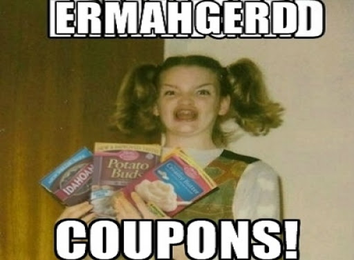
It’s no secret that customers are happy to make more purchases using coupons — everyone loves discounts! This means that the conversion rate increases and the amount of affiliate commissions increases. Also, coupons are not only a powerful tool for motivating partners already working with the program, but also a way to attract new ones to the program.
Moreover vary promocodes allow you to track how effectively audience interact with your ads in the growing world of cookie less internet.
Creating landing pages for your affiliate partners for increasing conversion.
The advantages are obvious. First, it offers users a specific offer, which means that it focuses their attention on one thing.
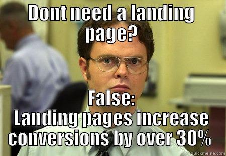
This will most likely lead to a targeted action. Second, the landing page has a simple structure, which means that the information is easily perceived. Third, the cost and speed of creating a landing page is also an advantage. Fourth, the user will not have to wait long for the page to load, because the landing page does not weigh much. The correct landing page structure includes: offer, product information, advantages, working scheme between the client and the customer, reviews, document section(diplomas, certificates), cost, order form(CTA), special elements(for example, time counter), contact information.
Some tips for creating a landing page. The design should be minimalistic, stylish, and the fonts should be clear. Alternate text with images. Place CTA at the end of the first screen. Use unique images. Landing page may dramatically affect performance of your ad campaigns. Ask your manager - Adoperator team can help you to find new ideas for your landing pages.
Create a clickable banner or native ad.
Banners and native ads are one of the most common forms of online advertising that allows you to increase online traffic. Banners are clickable images on web pages that demonstrate a product or brand and lead to a link to the advertiser's website. But there are so many banners on the Internet and often they are so unattractive that potential customers ignore them.
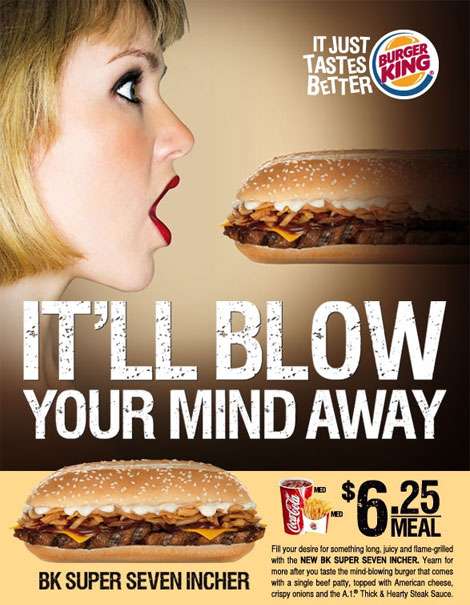
Let's talk about the rules that are recommended to follow in order for your banner to be clicked, and not ignored.
- Figure out the font. The title and text must be of different sizes and take up no more than 20% of the banner space. Make sure that the text is easy to read, because users will not be able to understand what is written on your banner for a long time. It is also Better not to use italics, capslocks, or fonts smaller than 10. Check for errors in the text.
- Create a simple and clear call to action. It should show what happens after the click. For example, "buy now" ," learn more", or" find out about a discount ". Button or attention sign is a great visual signal to action.
- Do not forget that the image must match the meaning of the text. Find out which product is a hit and use it on the banner.
- Choose colors based on what emotions you want to arouse in users. The colors on the banner must match the colors of the website. The banner should be bright, contrasting, but not annoying. The banner's task is to stop the user from flipping the feed.
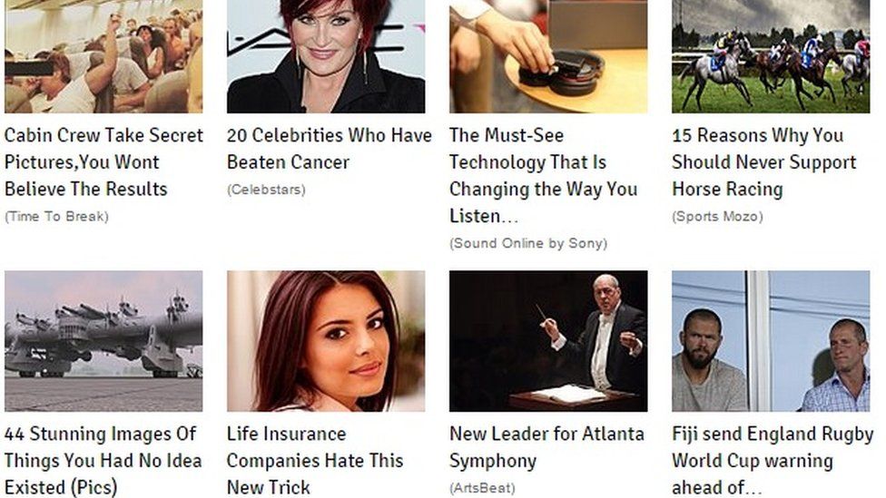
5. Come up with a catchy title. This is a key point when creating a banner. Try to choose a title and text that answers users ' possible questions, or come up with an intriguing message to attract their attention. If you know your target audience well, this gives you an advantage: phrases like "for men after 30”, “offer for birthday people " will show the user that they are addressing them. You can also try clickbait schemes as is usual at newspaper sites. Hot News industry know how to attract attention.
Clickbait ads
Use widgets, special elements that increase the functionality of the site and increase its convenience.
Your widget may contain some useful features: a feedback window, opinions block, or a comment window, a search window, or show sales hits and current promotions. In addition, widgets are easy to use. You simply make the widget code available to your affiliate partners and they insert it into their site.
A selling video is one of the easiest tools to attract attention. Video is several times easier for the brain to perceive than text.
Tips for creating a selling video ad.
- The ideal timing of a selling video is 30-120 seconds. The first 5-10 seconds are the most important. They will determine whether the user will watch the video to the end or not.
- Don't use standard slogans and enticements, be creative!
- Demonstrate your product in action. Show how it will solve the customer's problem.
- Avoid using small font and a large amount of text in the frame, because many users watch the video through a mobile device.
- Create an interesting and memorable story!
- Divide the video into several blocks so that the viewer has a couple of seconds to assimilate the information received. This can be done by using short dynamic screensavers with the brand logo or speaker pauses.
- The last few seconds of the video are no less important than the first. Remind the viewer of the main advantages of the product and make a successful call that will make the person perform a specific action as quickly as possible. For example, “Buy our inflatable pool in March and you will get free swimming glasses.”
- Use some animation. These videos attract more attention and viewers are more likely to share them with friends in social networks.

